Brand basics
Use the what3words brand principles to create a globally consistent experience that is relatable, reliable and spirited.

Brand principles

We make it personal

We inspire trust

We are full of energy
The what3words logo

The primary what3words logo is the Horizontal Logo with aRed symbol and Dark Blue wordmark. Minimum clear spaceis the height of the 3.
The download file contains reverse and single colour options as well as other variations of the lock up.
View and download assets by visiting the Symbol & Logo page.
Brand in text
what3words is always written in lowercase as one word with no spaces.
There are no capital letters even at the start of a sentence.
The name has no spaces and we avoid writing “w3w”.
More information about using what3words within text can be found on the Brand Writing page.
![]()
what3words
what 3 words
What3words
WHAT3WORDS
Don’t abbreviate – “w3w” or “W3W”
Colour
what3words core brand uses a lot of white, a little bit of dark blue and just a touch of red.
There are eight secondary colours and three tints of grey to add some extra colour to the world. We have also carefully selected our colour combinations to meet a AA+ standard, for more information about colour and accessibility head over to the Colour page.
Core brand colours

Dark Blue
HEX #0A3049
RGB 10 48 73
CMYK 100 60 20 50
PMS 540

Red
HEX #E11F26
RGB 225 31 38
CMYK 10 100 80 0
PMS 186

White
HEX #FFFFF
RGB 255 255 255
CMYK 0 0 0 0
Typography
For Latin scripts we use both Source Serif Pro and Source Sans Pro. They are both clear, precise and work well at the Regular to Black weights.
We use Source Serif Pro Bold for headlines and any impactful large scale type. This can be used in digital, product and print.
Source Sans Pro can be used for all types, but for accessibility purposes we do not use Light or Ultra Light weights.
To display copy over images we place the text in a band.
A what3words address is displayed as all text in the Semi-Bold weight.

Typefaces
what3words works in over 60 languages and we recommend specific typefaces for all other alphabets like Thai, Punjabi, Japanese and Cyrillic.
Text on images
A what3words address is displayed as all text, Semibold weight.

To display text over images we place the text in a band.
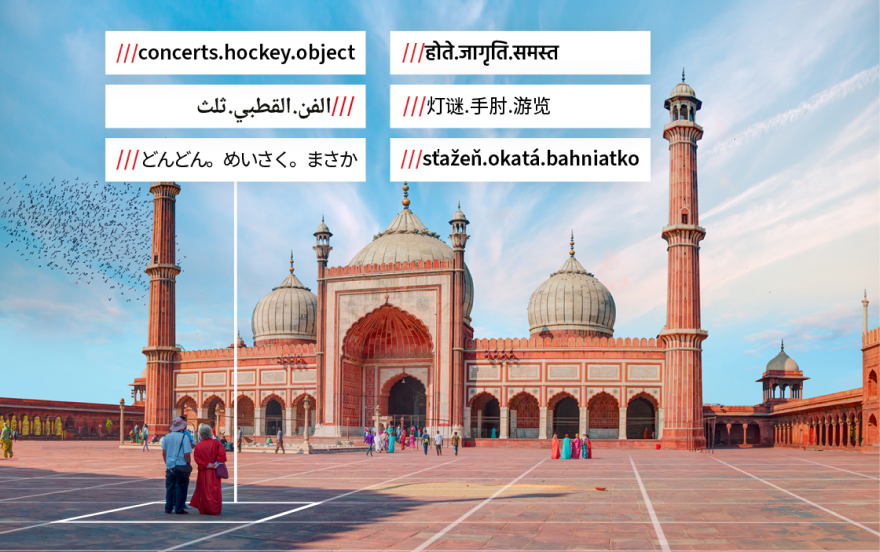
what3words address
A what3words address display format is lowercase text: three forward slashes word dot word dot word. There are no spaces. The forward slashes can be added as text in most cases.
More information about what3words addresses can be found on the Formatting Best Practice page.

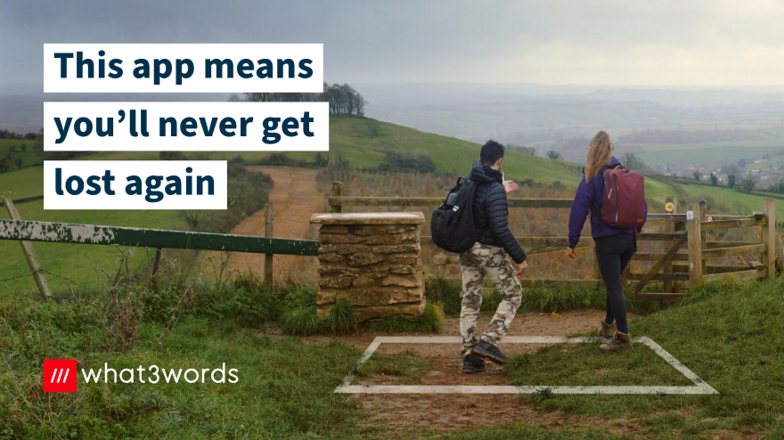
Imagery
Our imagery tells stories about real people and the ways they use what3words to improve lives around the world. Our images show a clear use case, are authentic and are never exploitative.


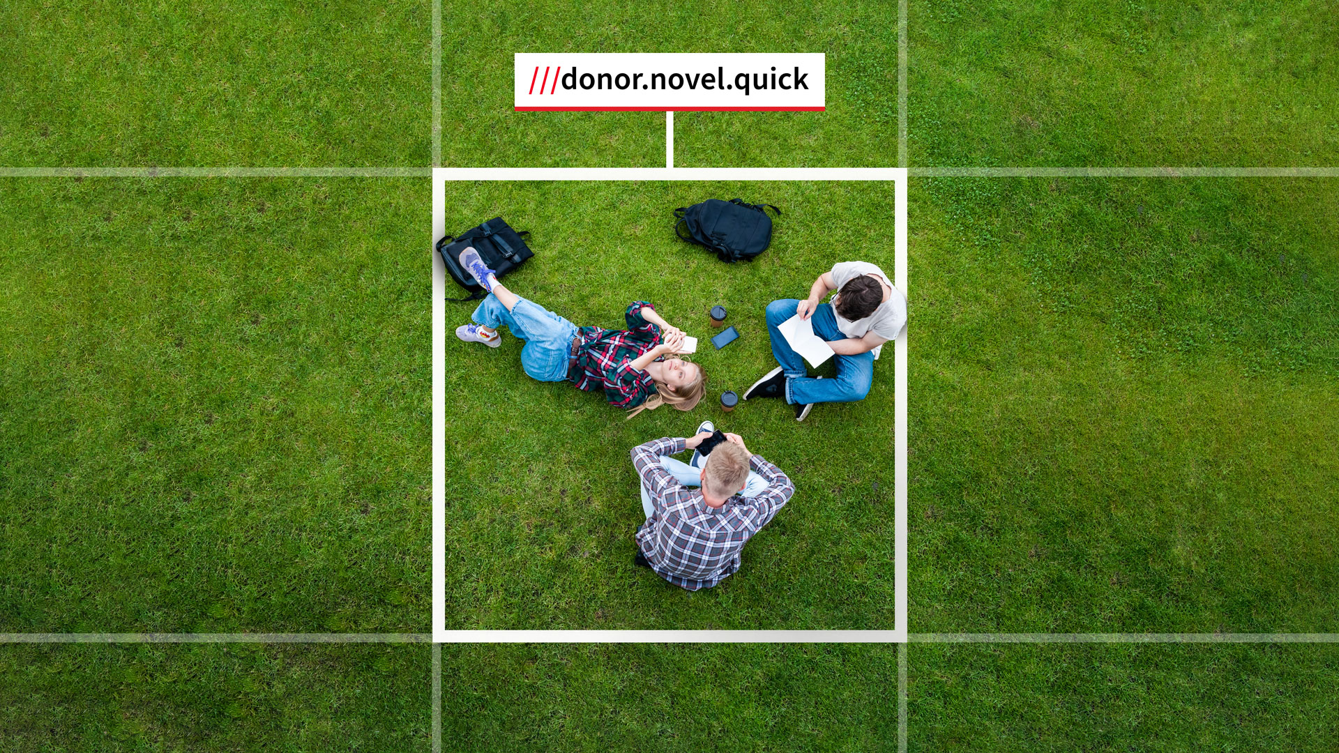
Grids & Callouts style
The grid is made of 3 metre squares which we show as a graphic overlay in stills and motion. This helps the viewer visualise how what3words works. A 3 metre square is about four steps across.
A callout is what we call a what3words address graphic that points to a specific location on an image. It’s important to show the ground to connect a what3words address with a 3 metre square location on the earth.
Be as accurate as possible, and respect the privacy of private homes and government areas by choosing demonstration locations.
More information can be found out about animating elements such as callouts on the Video page.


what3words glyph

For web and app developers
The what3words symbol glyph can be used as an app or feature icon with the word “what3words”. It can also be used with a what3words address or input field.
Please don’t use the /// glyph without the what3words brand name or a 3 word address.
There are also what3words Voice and Scan glyphs available to download.
Looking for more guidance?
If you have any other brand and design related questions contact: design@what3words.com