Formatting best practice
A what3words address is easier to use when displayed in a consistent format that people are familiar with. Our goal is to make it simple for anyone to recognise and use what3words to reliably find precise locations.
Elements
A what3words address is designed to be easy to read, write, say, and be recognised by computer systems.
It comprises of three forward slashes, immediately followed by the three words in lowercase (no spaces, except in Vietnamese where spaces within words are allowed within certain rules – see RegEx guide), each separated by a dot (the default separator is a full stop in all languages, except in Japanese where the default separator is the ideographic full stop; whilst these are the default display separators, other separators are allowed, see the RegEx guide).
For example: ///table.lamp.spoon
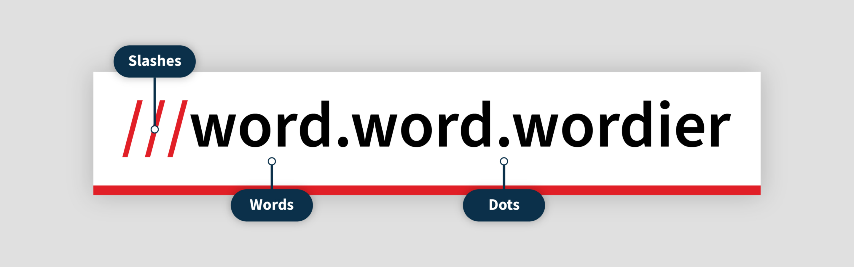
Slashes – Three forward slashes, no spaces, same weight. Use red or any other colour.
Words – The character length may vary. No spaces before or after. Keep the same weight and colour.
Dots – (full stop or period) No spaces before or after. Same weight, same colour.
Text only – ///nation.jumper.stone
Vertical stack

A whatwords address is usually presented in one line but can also be stacked on 3 lines if necessary.
Languages

what3words is available in over 60 languages in the app and website.
Each language has a unique word list so never directly translate a location. Use the app or map site to find the unique what3words address in that language and verify it is correct.
On images
When displaying a what3words address over a photograph or in a video, use the callout designs below or create your own. You can also use the Photo feature in the what3words app to add a sticker to an image. We’ve provided some examples below.
1. Use a bounding box to ensure high legibility on complex images
2. Adding area information (Area, Country) helps your audience understand the purpose of the sticker
3. Power tip for placing squares: 3 metres is about 4 normal steps long or about the size of a parking spot

In text
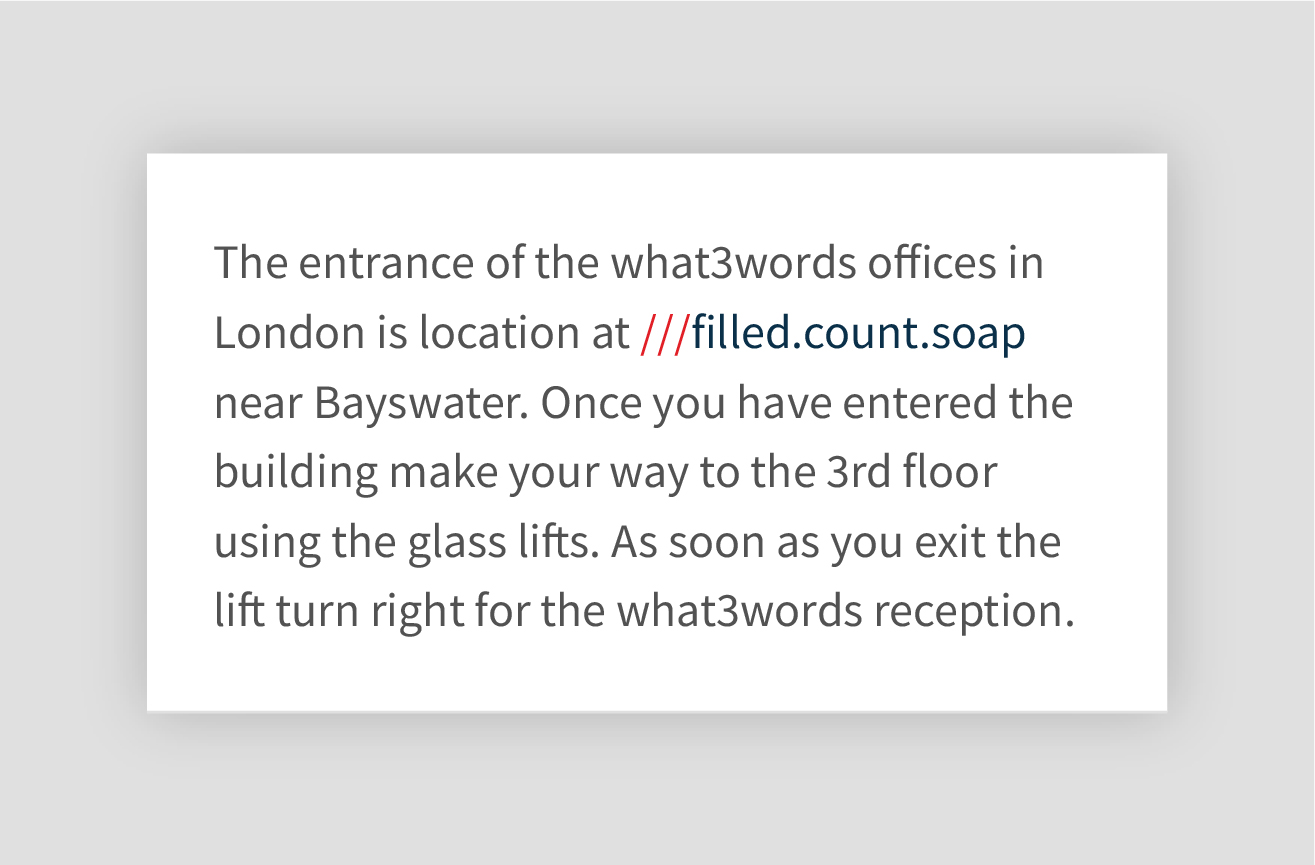
1. Always use “///” to make it easier to identify a what3words address in text. e.g. ///filled.count.soap
2. No spaces between letters, and avoid line breaks in a what3words address
3. Use the same font as the paragraph of text
4. Avoid italics and ensure a high contrast with the background
5. Test legibility using the Scan feature in the what3words app, sans-serif typefaces work best
On labels
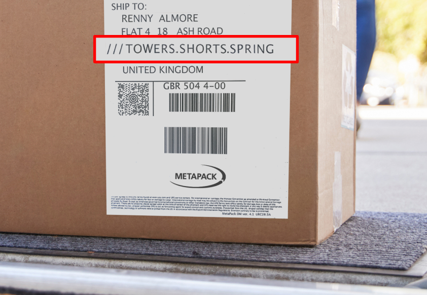
what3words doesn’t replace other address information on a delivery label, more is always better.
1. The what3words address should appear after the other address information
2. Only produce in one colour (black is preferable)
3. Test legibility using the Scan feature in the what3words app, san-serif typefaces work best
5. Add “what3words” if needed before “///word.word.word” to indicate what the address is
On signage

Signs are a permanent and visible way to display a what3words address on your front doors, business entrance, delivery points and facilities. They remind your customers and employees of your what3words address and encourage them to use it.
Accuracy & privacy notice
what3words is accurate to 3m square. Be aware that publishing an incorrect location can cause navigation issues, accidents, confusion, wasted time and irritated customers. Double check your what3words address on the app or mapsite and use satellite view to ensure accuracy.
Be aware that a what3words address can also be a home address. Don’t share private information in the public domain without written permission.
Pixelate at least 2 words to ensure privacy (It’s possible to use Auto Suggest to work out an address with only two words.).
More information can be found on the Legal page.
Looking for more guidance?
If you have any other brand and design related questions contact: design@what3words.com